Art I
|
|
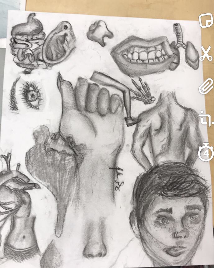
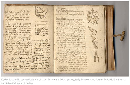
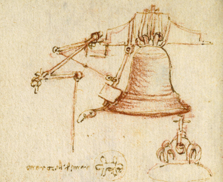
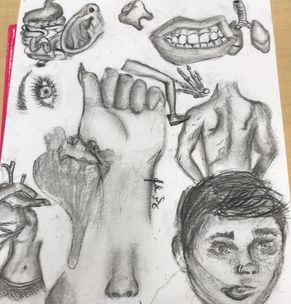
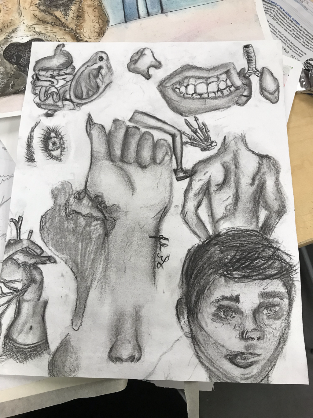
The artist's name is Da Vinci and he lived in London were he would use magnifying paints and pencils to make his peaces. He started to record his thoughts in a notebook in the 1480s and that is how his notebook art pieces came to be known. He was also in the military and would keep his notebook of art with him. I relate a lot to his work because of the designs and different objects scattered along the paper are just like in my body parts drawing with charcoal I did during class. The art style he chose in the notebooks relates to a lot of my art pieces.
The Victoria & Albert Muesum published Da Vinci's art digitally.
The Victoria & Albert Muesum published Da Vinci's art digitally.
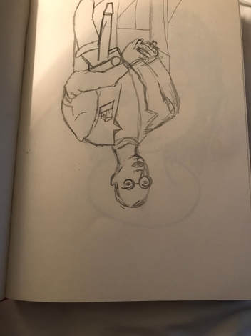
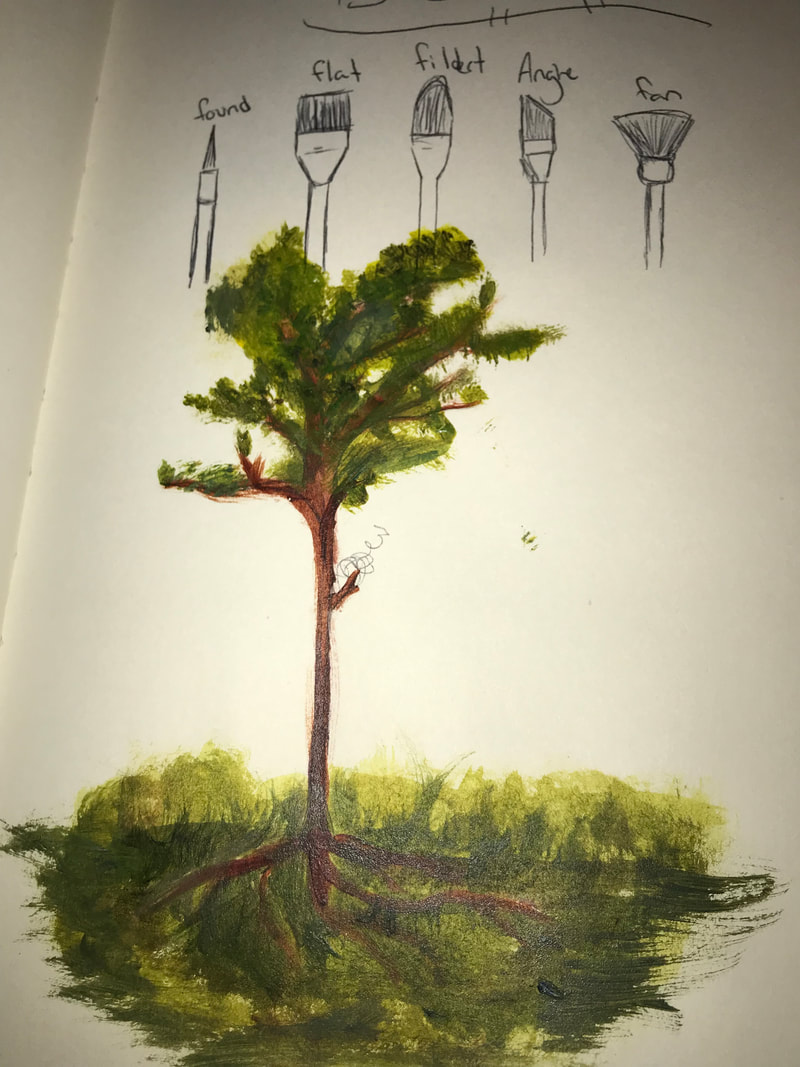
the warm up that was the most helpful to me was the upside down picture, mostly because of how when i was creating the peace it made me see different perspectives to look at.
|
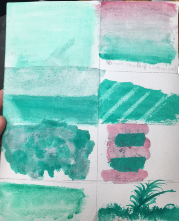
composition: the placement of a visual element in a work of art.
value:the relativity from light to dark. |
Pros and Cons:
- pens; are good for texture but not for if shadowing.
- pencil; are good for caching out a peace but not for trying to make a part of a peace have brighter colors (not as good as pens)
- charcoal: are good if you make mistakes easy and need to get rid of a part of a peace you can j blend it out. hard if you don't like getting dirty.
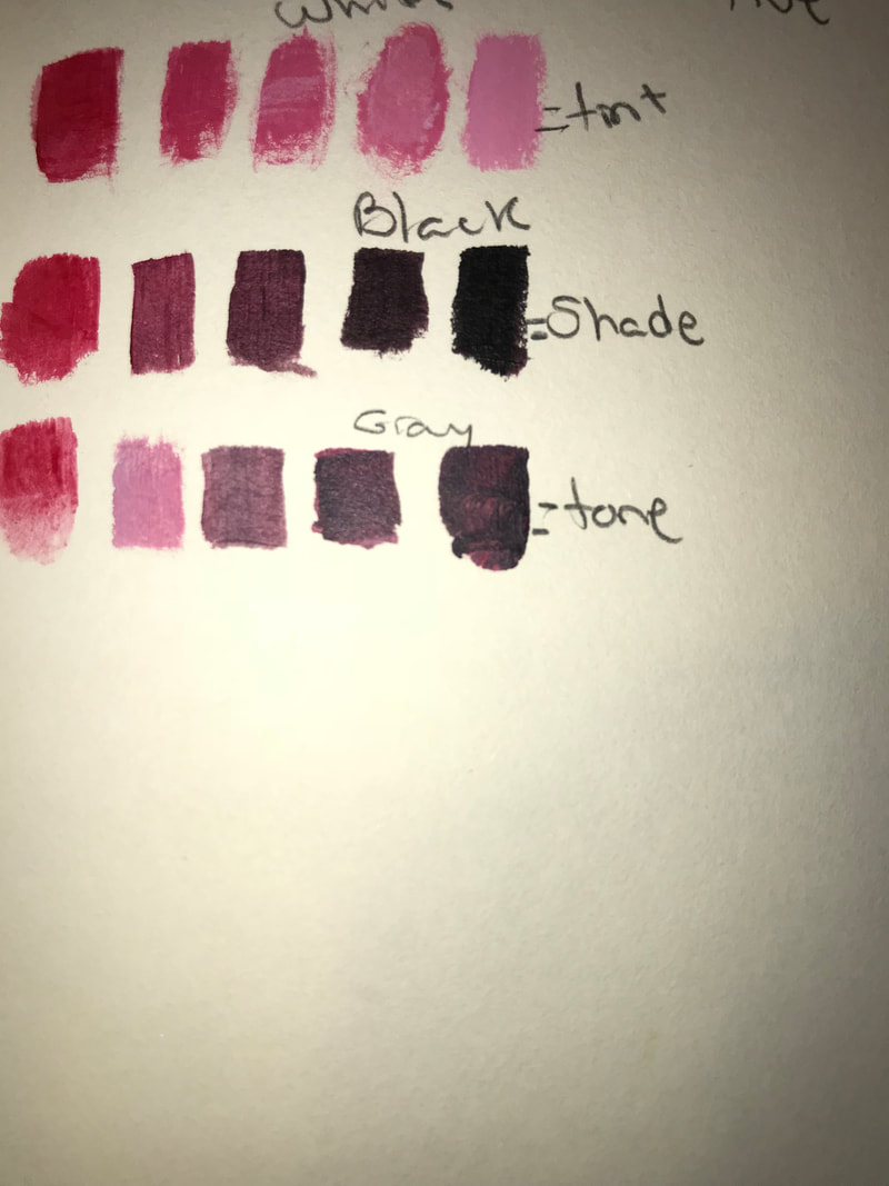
Q1: I've learned how to make different colors from paints and how to change the tones of my art peaces using lights and dark in my paintings.
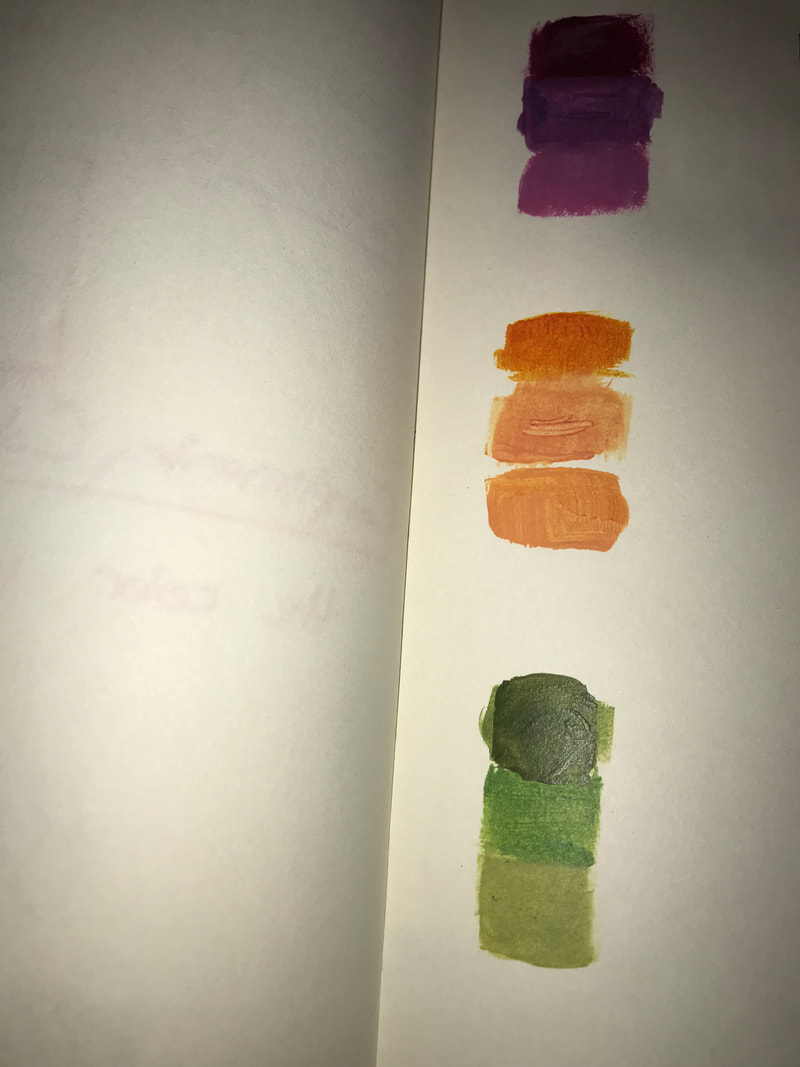
Q2: To me the best warm up to help me paint my art project would have to be photos of color matching(purple, orange, Green), because i have all of these colors in my peace and i would have known how to make it without that warm up.
Q3: The most i have learned from is the making skin tones, i will use that in my art pieces in the future in your class which ill help me so i wont make my person look to orange or yellow.
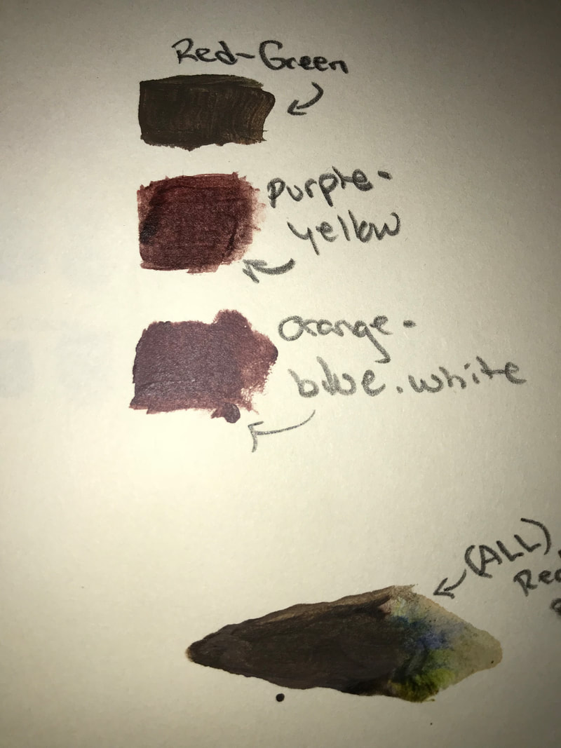
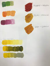
Q4: ways to make brown are..purple and yellow, orange blue and white, and red and green.
Q5: tones drown color by if you make a tone too light it will turn white and if a tone is too dark it turn black.
Q2: To me the best warm up to help me paint my art project would have to be photos of color matching(purple, orange, Green), because i have all of these colors in my peace and i would have known how to make it without that warm up.
Q3: The most i have learned from is the making skin tones, i will use that in my art pieces in the future in your class which ill help me so i wont make my person look to orange or yellow.
Q4: ways to make brown are..purple and yellow, orange blue and white, and red and green.
Q5: tones drown color by if you make a tone too light it will turn white and if a tone is too dark it turn black.
- Describe the artwork. List what you see. What images do you see? How would you describe it over the phone? Which art elements? Describe the color schemes.
- Analyze the artwork. List art elements and design principles. Color, value, line, shape/form, texture, space. Balance, emphasis, harmony, variety, movement/rhythm, proportion.
- Interpret the artwork. What is the mood? What feeling is communicated? What ideas are represented? What is the story being told.
- Judge the artwork. What do you think of the artwork? Is it successful? Why or why not? Support your opinions with evidence or criteria. (Art skills, meaning, creative, realistic)
2. CRITIQUE an older piece of your work.
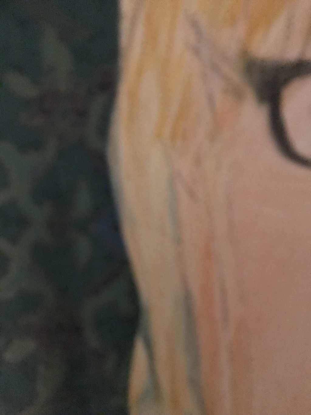
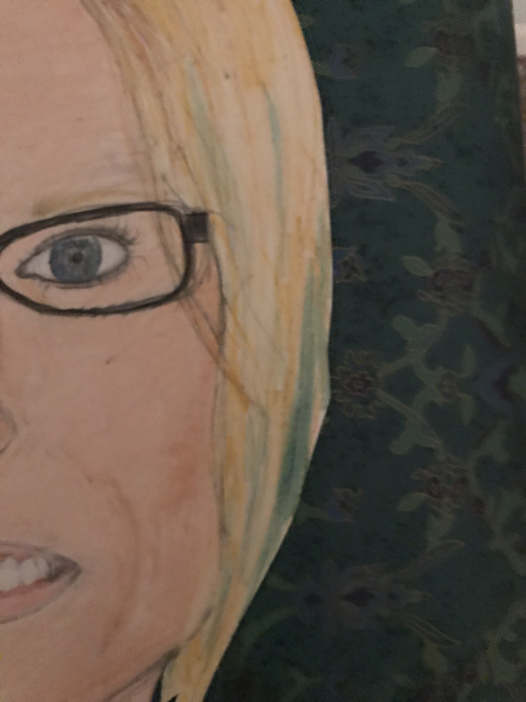
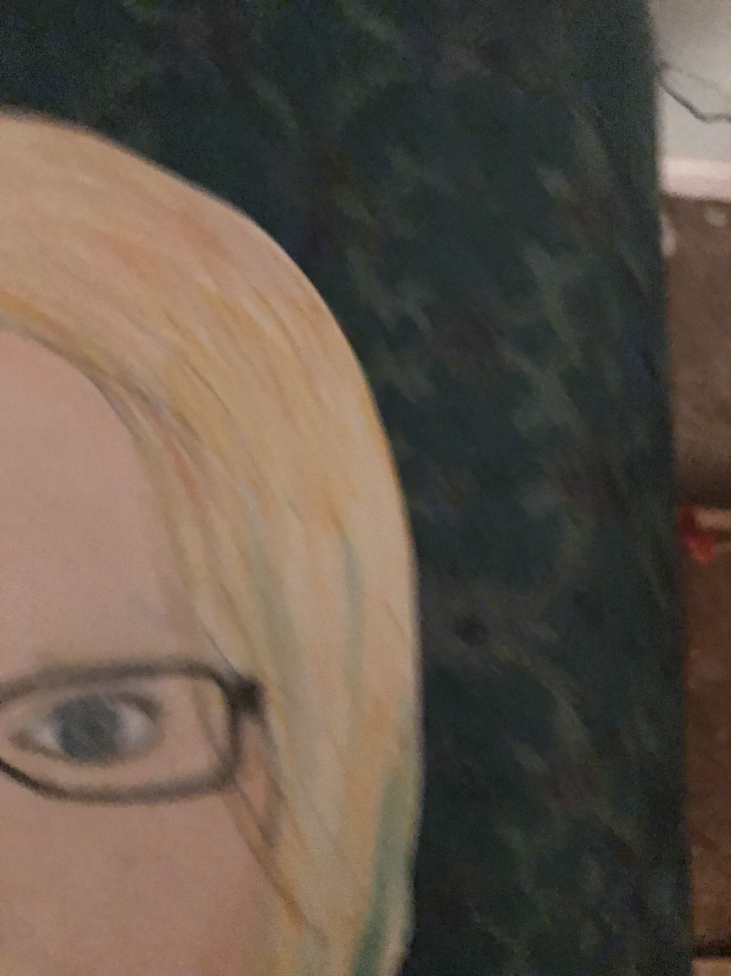
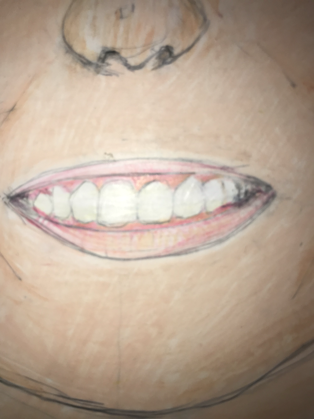
- Describe transparent in the lack of color shown on the peace and body part all created a person and showing every peace in its glory little by little and the most you look the more you will see
- Analyze the artwork. There aren’t lot of colors , but it balances well because of the black over everything and people aren’t just one color so I leave that to the imagination This piece is made with the amount of non color being the exception. All the components are spaced out fairly evenly. I tried to make it balanced, but there is definitely more going one too many pieces with everything in the middle. The proportion is definitely off considering bodys would never be that big from the surface, but that was a stylistic choice. There is a lot of variety in color, shape, size, style, medium, etc, but I think it all goes together as a final project.
- Interpret the artwork. I tried to make the mood of this piece match the song that inspired it. The song gives me a feeling of wonder, and of awe. I think this piece was semi-successful with that. I like the feeling the planets and the mountains give off. But, I think it would’ve been better if I had made it more detailed. It definitely helps to read the words. The idea that is mainly represented is that if God created everything, all these beautiful things in the world, to bring glory to Him, we should, too.
- Judge the artwork. Personally, I really like this piece of art. I think it came out really well for my first mixed media piece. The meaning is easily seen, with the words and visuals incorporated. It is not realistic but that was a stylistic choice. I think it is creative, but still very literal considering the lyrics. I don’t think you need a lot of skill to make this piece since all the techniques are fairly basic, but there are many techniques incorporated (watercolor, acrylic paint, mixed media layering, etc). I think this piece is successful. For all those reasons.
- What did you learn from these activities?
2.Which one do you feel will be the most helpful for the painting you have planned?
The warm ups will help me with the paintings i've planned.
3.Which one did you learn the most from either it was successful or not? Why is that?
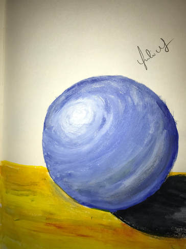
the warm up i learned the most from was when we were making shades and creating shadows in a ball.
4.What are some ways to make brown?
yellow, red and green and orange blue white.
5. How to do tone down a color?
add white to the color.n
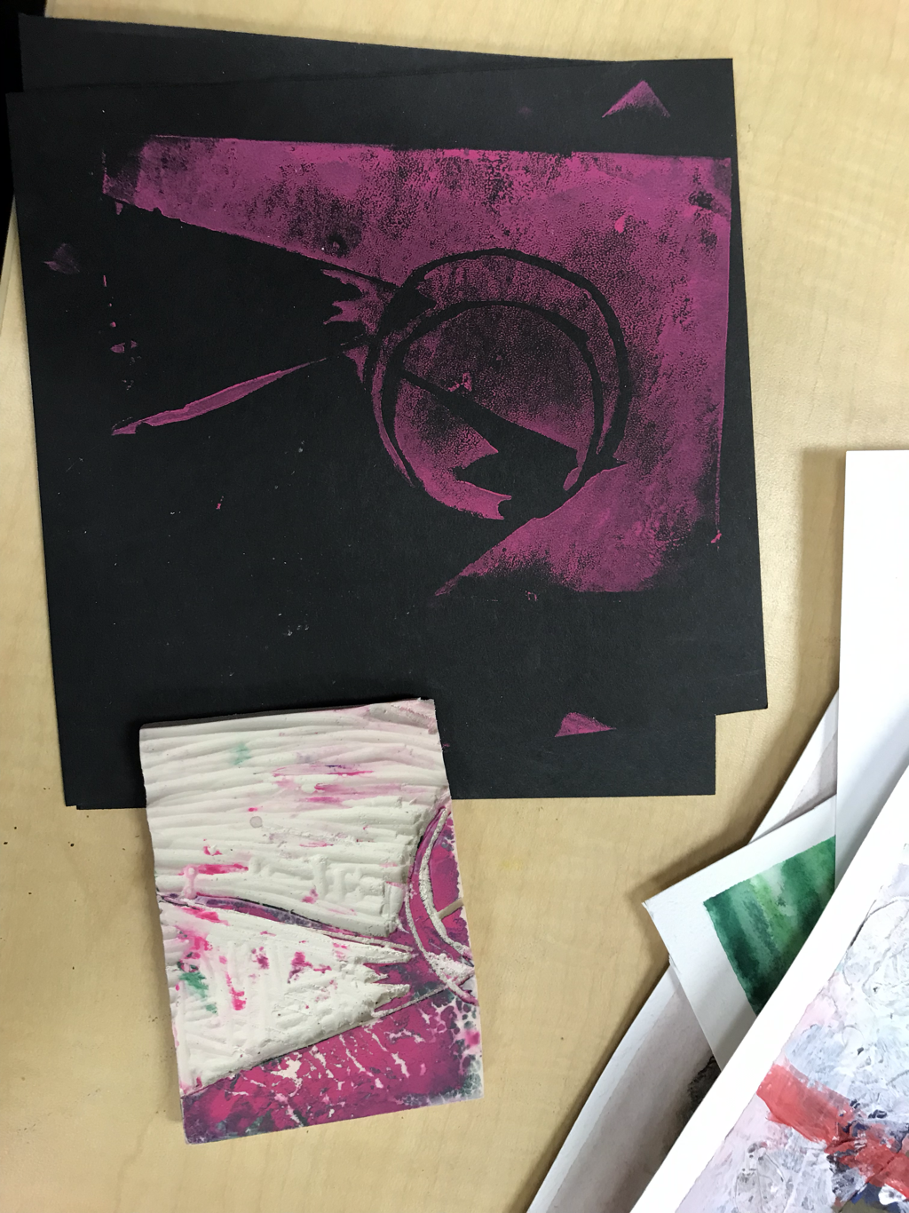
 20. Was there a tool you had never used before and learned in this class? What was it and how did you use it? 20. Was there a tool you had never used before and learned in this class? What was it and how did you use it?Before this class, I had never used the Lino Cutters. I learned how to use these to carve a linoleum stamp for prints. The assortment in sizes allowed me to make really narrow lines that I think ended up looking really cool. I had so much fun with that project that I got a set of these for Christmas! I can’t wait to make more prints. 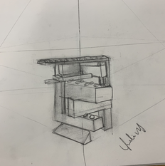
1 What do you plan to do with your piece? How do you plan to finish it? (3 sentences minimum) i will put a peace of wood to take in the circle, paint it blue and create a lock for the lid.
|
|


- What activity did you find most helpful or interesting in learning the process?
- I found that it is more helpful to see the different perspectives of a art peace .
- What do you like about watercolor?
- my favorite thing about water color is hoe you dont need a lot of the paint all you have to do is put water and it spades.
- What do you find difficult about watercolor?
- trying to maintain it with water as it trys to spread on the paper.
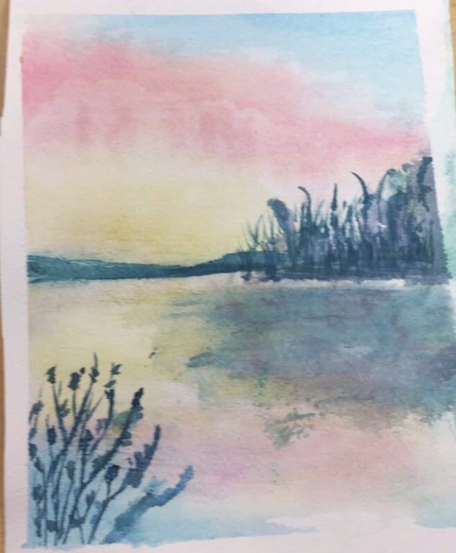
1. The warmup I found most helpful was the watercolor techniques page. I like painting with watercolors at home, but I didn't know a lot of that! It was super helpful and I think the page itself actually looks really cool.
2. One thing I like about watercolor is the way the colors look when its dry, the aesthetic of it is very nice. I also like how easy it is to blend.
3. I find controlling the paint very difficult. I also find it difficult to find the right amount of water to paint so I don't get a SUPER concentrated color but it also doesn't create a harsh line when dry.
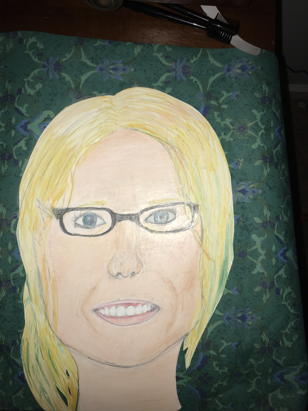
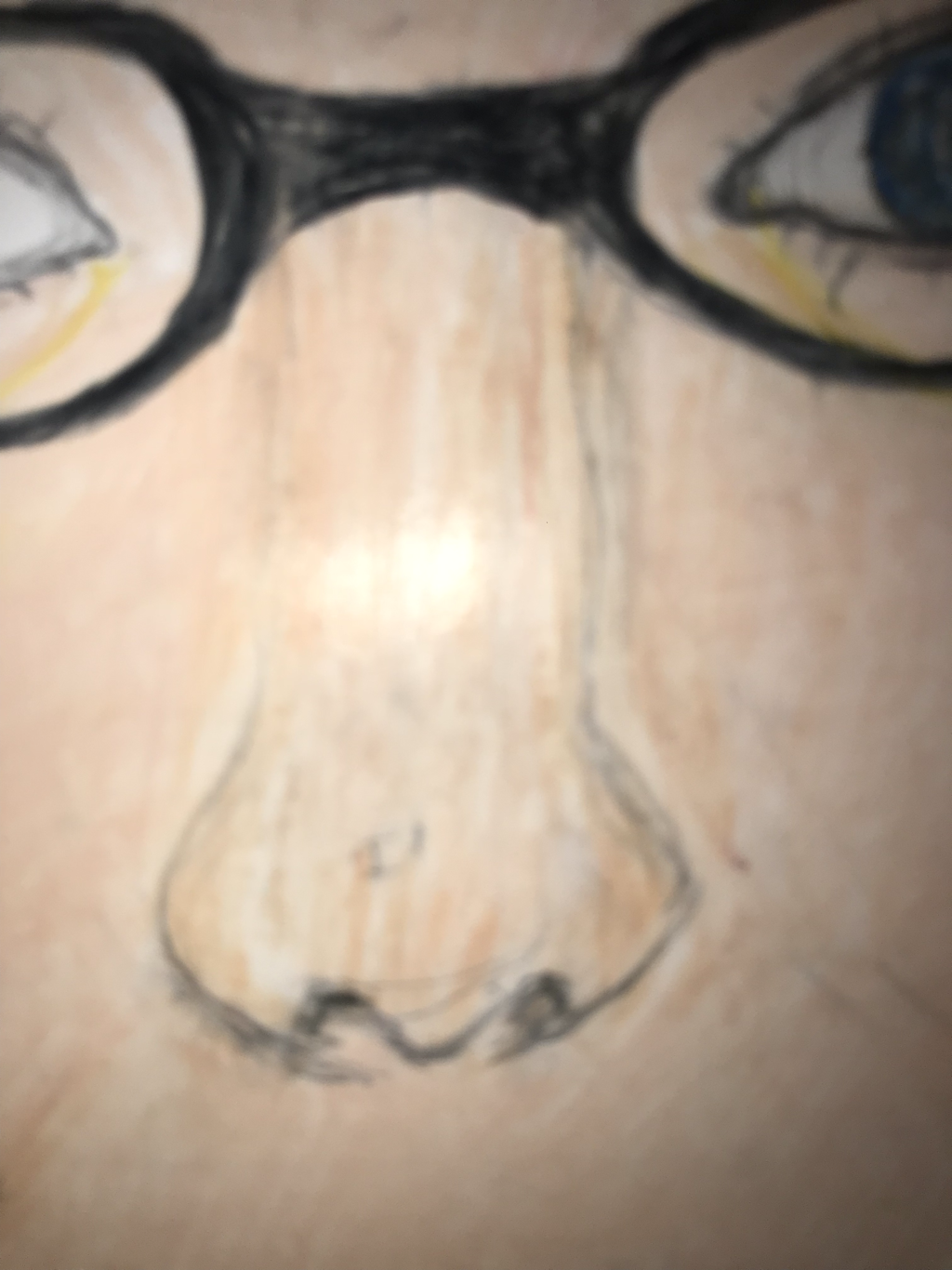
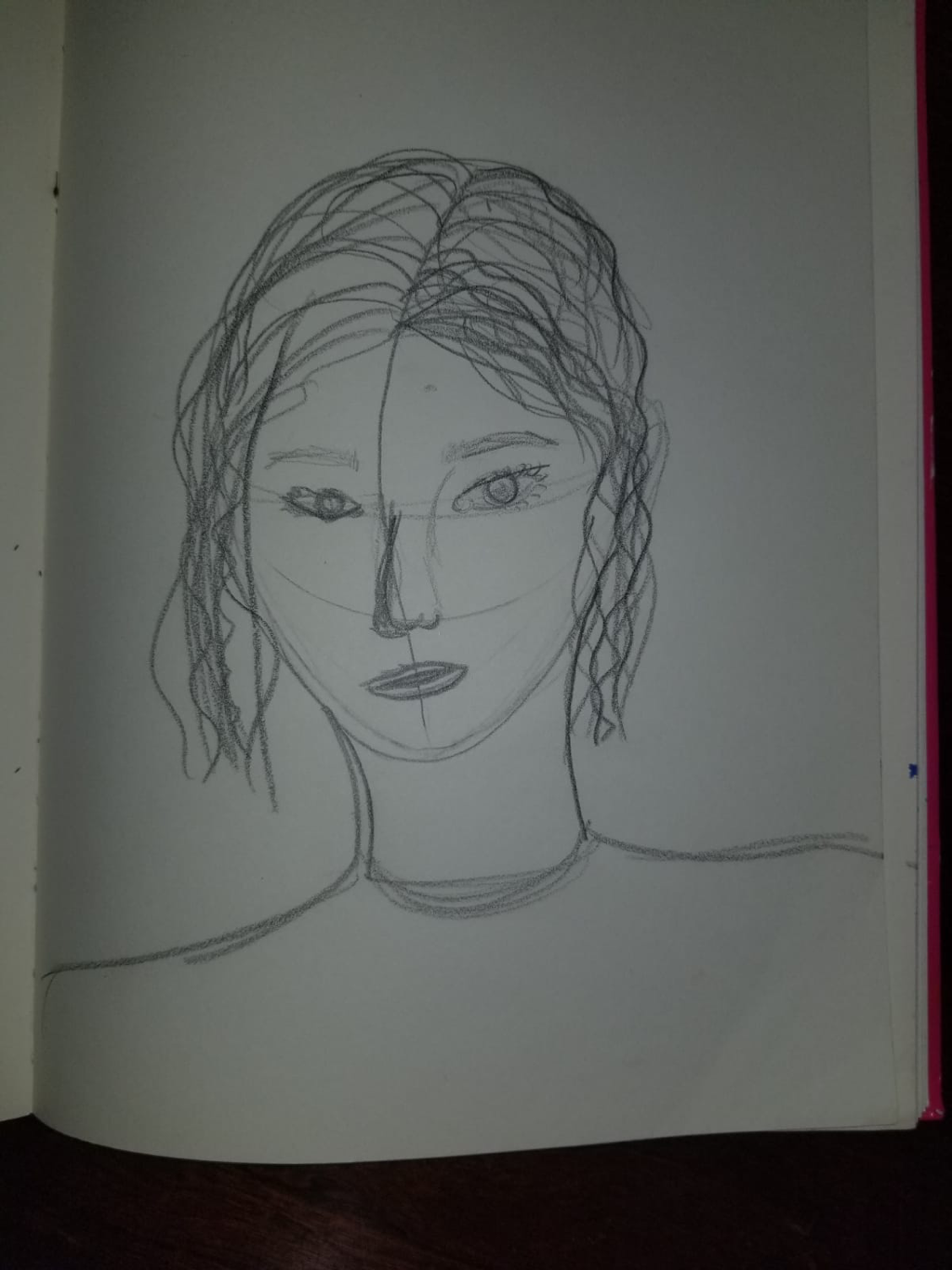
1. I made this portrait of Layla Ballinger, my sister.
2. I chose to use watercolor and mixed media.
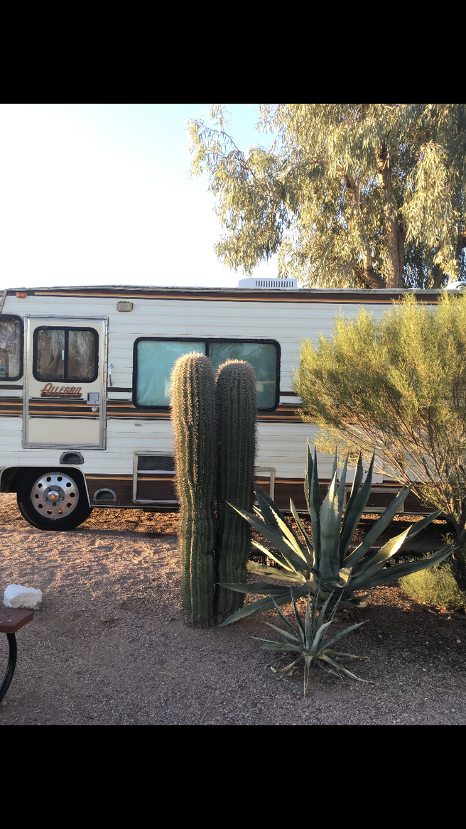
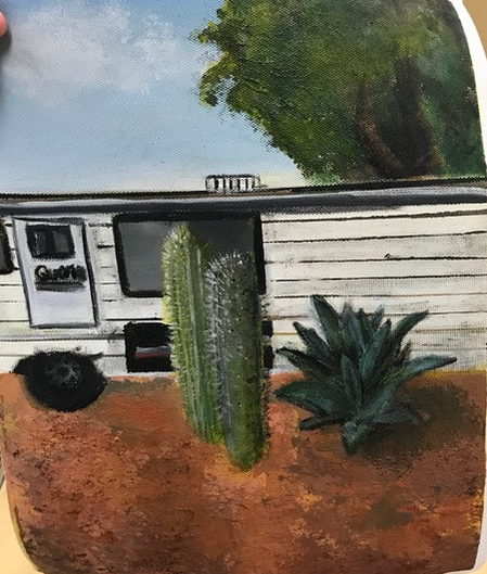
3. First, I chose a reference photo, which took a lot longer than expected. Next, I drew it out and had to change it a lot, with Ms. Sudkamp's help because my proportions were very off. Then, I transferred the drawing to watercolor paper, and painted it. I wanted to make the reds really pop even though they're not that prominent in the photo... I just thought it would look cute. I added eyelashes with pen, which is the only thing I really, really regret. Then, I copied some pages of Harry Potter, my sister's favorite book series, and a few copies of the page with her favorite Luna Lovegood quote on it. I splattered and painted pink and red watercolor paints onto the pages, let them dry, cut them up, and glued them onto a canvas board to create a collage background. Finally, I cut out my watercolor painting and glued it onto the canvas board.
4. I find most of the face (especially the nose) successful. I'm happy with her eyes, just not the eyelashes. I really love the background, too. If I did it again, I would be much more careful while doing the eyelashes, and being gentle with the paper, since some spots of the paper are a little gross.
2. I chose to use watercolor and mixed media.
3. First, I chose a reference photo, which took a lot longer than expected. Next, I drew it out and had to change it a lot, with Ms. Sudkamp's help because my proportions were very off. Then, I transferred the drawing to watercolor paper, and painted it. I wanted to make the reds really pop even though they're not that prominent in the photo... I just thought it would look cute. I added eyelashes with pen, which is the only thing I really, really regret. Then, I copied some pages of Harry Potter, my sister's favorite book series, and a few copies of the page with her favorite Luna Lovegood quote on it. I splattered and painted pink and red watercolor paints onto the pages, let them dry, cut them up, and glued them onto a canvas board to create a collage background. Finally, I cut out my watercolor painting and glued it onto the canvas board.
4. I find most of the face (especially the nose) successful. I'm happy with her eyes, just not the eyelashes. I really love the background, too. If I did it again, I would be much more careful while doing the eyelashes, and being gentle with the paper, since some spots of the paper are a little gross.
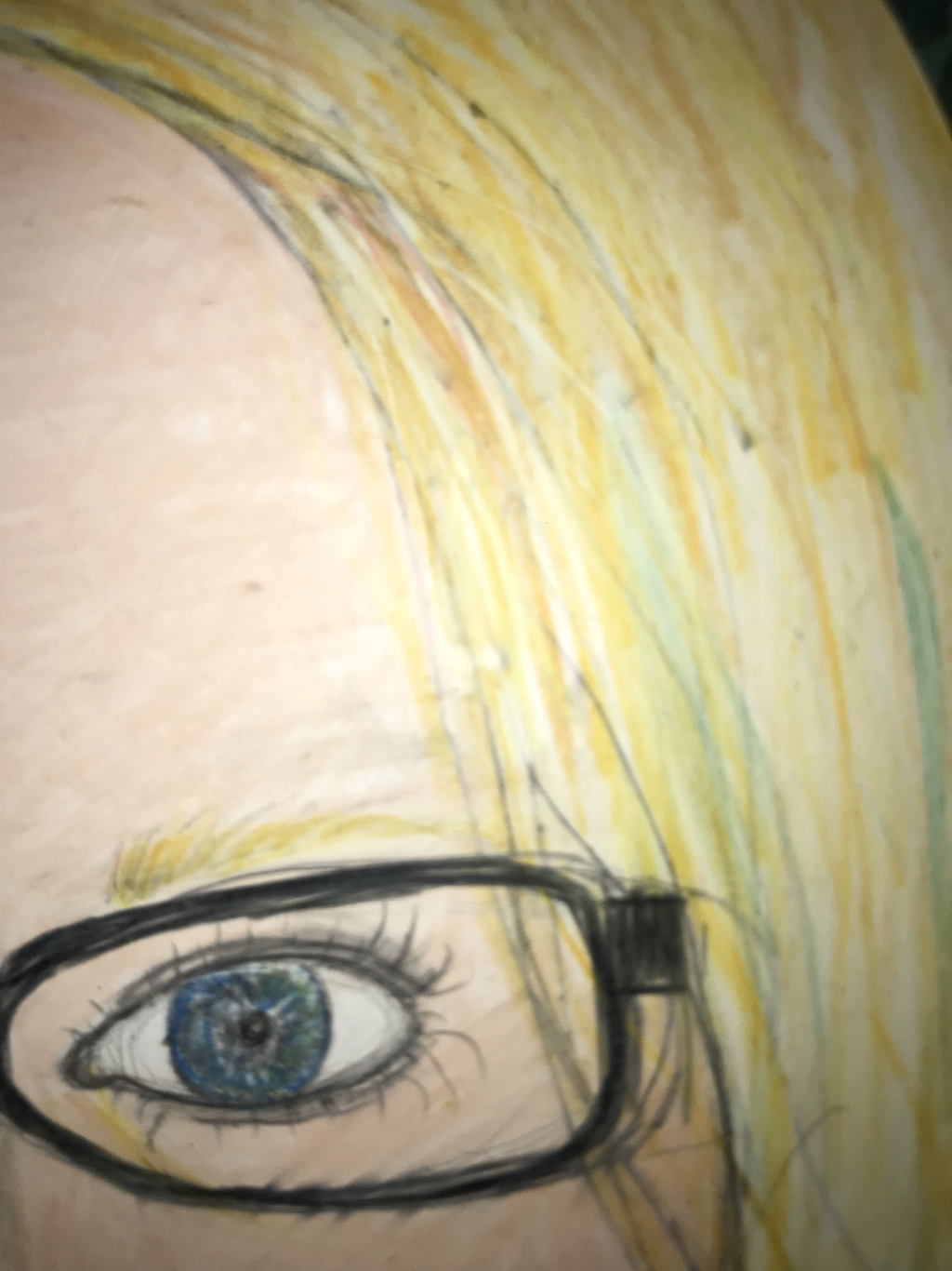
- What warm up is proving to be the most helpful so far in your portrait piece? Explain. The warmup that has best helped me with this peace is the face shape.
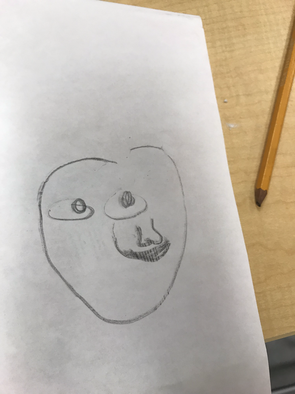
- What did you find most surprising about the facial proportions and why? How had it was to make a skin ton.
8. What was the warm up or sketchbook assignment that you learned the most from?
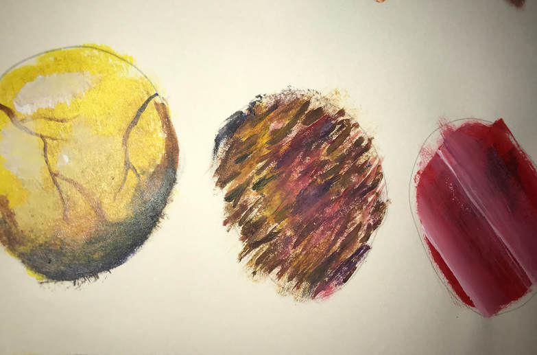
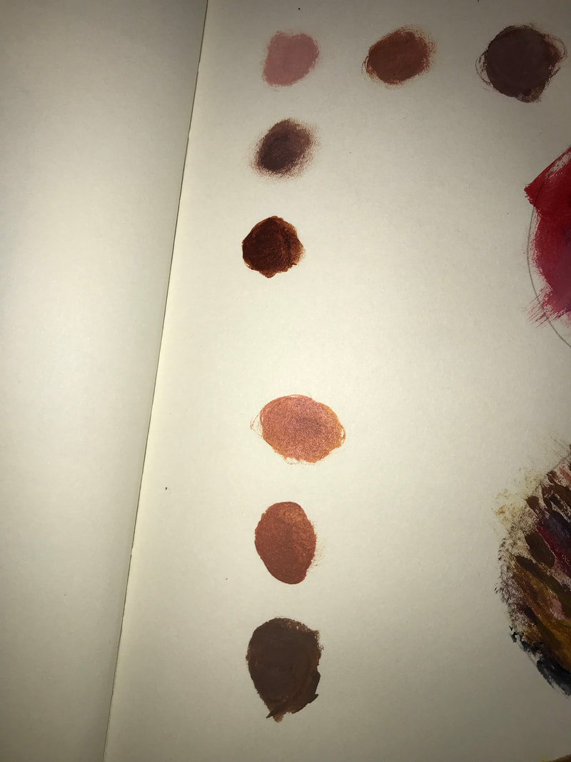
The warm up I learned the most from was the one where we mixed different acrylic paints to make different browns, tints, shades, and tones. I had painted before this class, but I didn’t know a lot of that stuff. It was difficult to get the hang of making brown, but I’m really happy I figured it out. It’s proven to be very helpful. Learning that adding gray made a different tone helped a lot, too.
 13. What did you find most difficult about this class? This could be anything from gathering materials, to generating projects ideas, to applying a particular technique. What could be done to resolve this issue in the future?
The thing I found most difficult about this class is that you were with other people while creating my art. That was just something I wasn’t used to, I’ve only ever made art alone before this class. I like working around people so I can bounce ideas off of them and get some constructive criticism. But this class was a little weird because no one was talking, so I sometimes ended up feeling self conscious about my art, which is to be expected because I was learning new techniques. I think some more conversation would help, maybe some icebreaker games at the beginning of class or some warm-ups where you’re required to get to know the people around you would help. This warm up is one I thought helped a little with that.
The warm up I learned the most from was the one where we mixed different acrylic paints to make different browns, tints, shades, and tones. I had painted before this class, but I didn’t know a lot of that stuff. It was difficult to get the hang of making brown, but I’m really happy I figured it out. It’s proven to be very helpful. Learning that adding gray made a different tone helped a lot, too.
13. What did you find most difficult about this class? This could be anything from gathering materials, to generating projects ideas, to applying a particular technique. What could be done to resolve this issue in the future?The thing I found most difficult about this class is that you were with other people while creating my art. That was just something I wasn’t used to, I’ve only ever made art alone before this class. I like working around people so I can bounce ideas off of them and get some constructive criticism. But this class was a little weird because no one was talking, so I sometimes ended up feeling self conscious about my art, which is to be expected because I was learning new techniques. I think some more conversation would help, maybe some icebreaker games at the beginning of class or some warm-ups where you’re required to get to know the people around you would help. This warm up is one I thought helped a little with that.
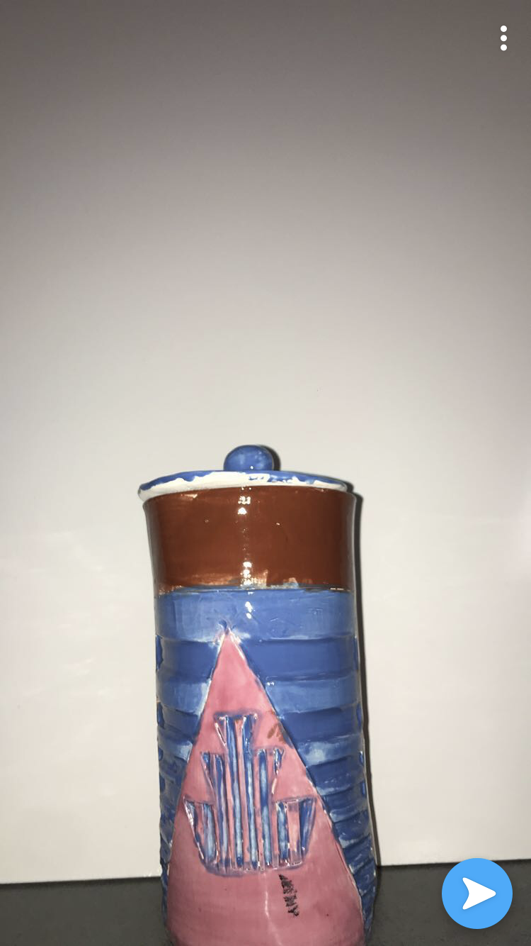
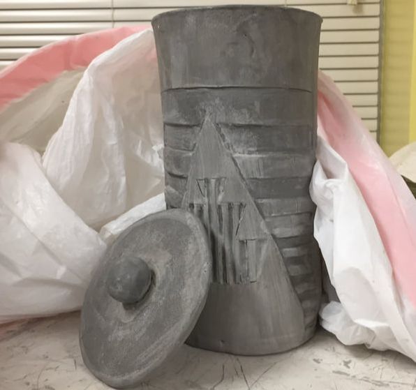
1. My finished piece shows off the theme of "line" because the sketch was a line in the clay with the triangle , and there isn't any shading. It's just made out of solid lines of varying width.
2. I think my piece was successful because you can easily tell what it is and I'm very pleased with the result. It's not perfect, for example, I didn't use enough ink for the print but I like the look better than if I had used the correct amount. Next time the only thing I would change is I would be more careful when carving lines that are thin.
2. I think my piece was successful because you can easily tell what it is and I'm very pleased with the result. It's not perfect, for example, I didn't use enough ink for the print but I like the look better than if I had used the correct amount. Next time the only thing I would change is I would be more careful when carving lines that are thin.
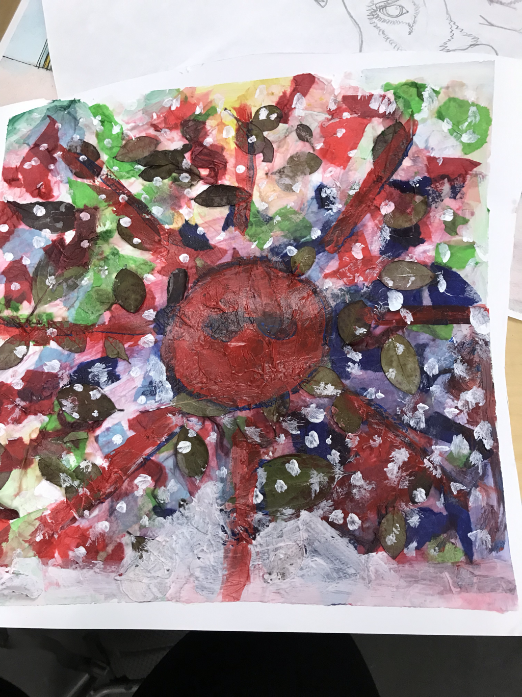
i took tissues paper and file it with glue then panit it with blue and green. Then add snow and leaves. Then paint a red sun.
Pros it looks really cool layered
cons it’s a lot of work
Pros it looks really cool layered
cons it’s a lot of work
1. Mix your own colors by grinding earth pigments together. You can use a blender and then use a binder to keep it together. Experiment with different brushes and surfaces.
2. Try adding a lot of different paints to a lot of different surfaces to understand how each paint looks on each surface.
3. Mix colors on the computer, make tints, shades, etc.
2. Try adding a lot of different paints to a lot of different surfaces to understand how each paint looks on each surface.
3. Mix colors on the computer, make tints, shades, etc.
Woodblock: A print made onto a block of wood. This may include several colors and engravings.
M. C. Escher was a Dutch graphic artist. He made woodblocks, woodcuts, lithographs, and other types of prints.
M. C. Escher was a Dutch graphic artist. He made woodblocks, woodcuts, lithographs, and other types of prints.
Print: a print is a transfer of an image from one surface to another.
Inking: applying ink to the printing plate with a brayer.
Transfer: when the printing plate is pressed onto the material, making a copy of the original image.
Edition: a series of the same print made from the same plate.
Relief Printing: when the artist cuts away at areas of the stamp where they do not want ink to touch the surface.

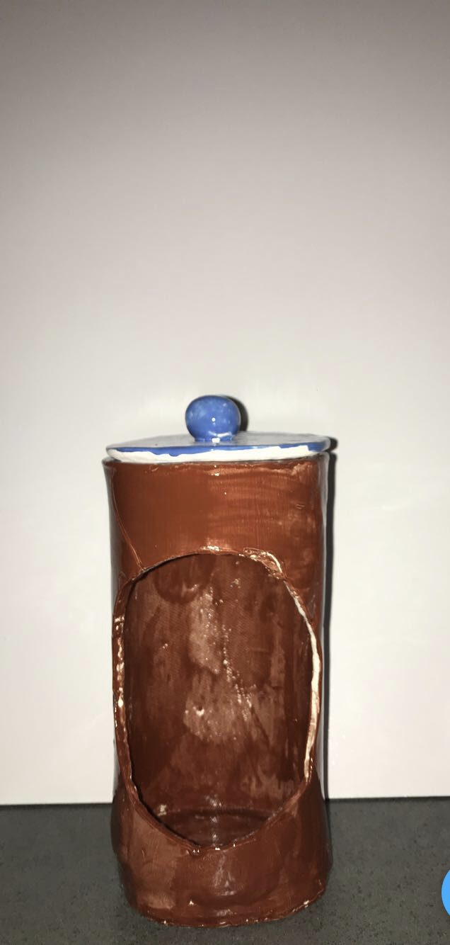
1. By the time I did the in progress post, I was mostly finished. All I've done since then is fired it, glazed it, and fired it again.
2. I think the colors, the decorations, and the inside textures are the most successful. I didn't accidentally drop it and destroy it, so I'd consider that a success.
3. If I were to do it again I'd be more careful when shaping the top and smoothing everything out. I kinda ran out of patience and just rushed through making the top and now it bothers me that it doesn't line up just right.
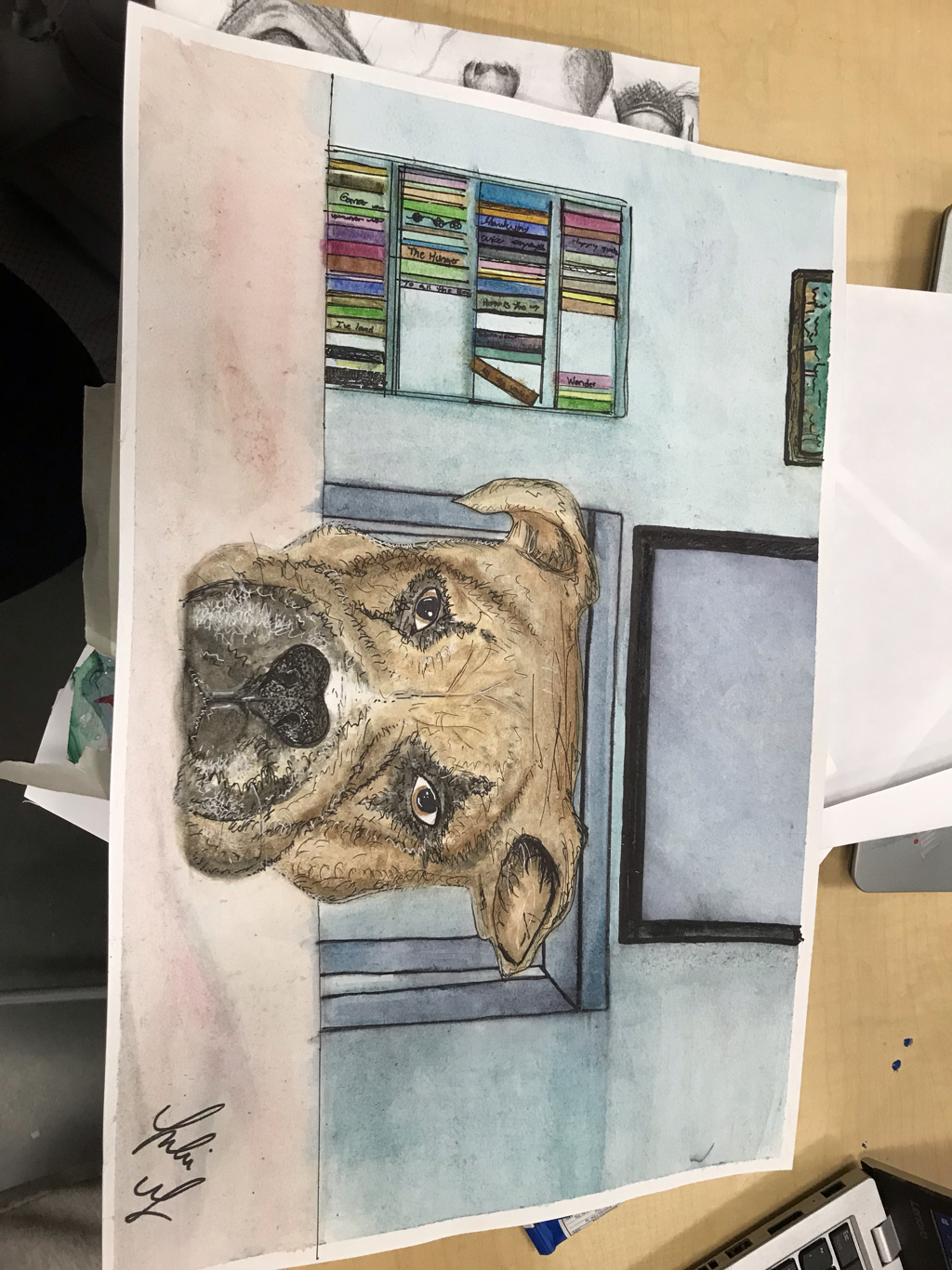
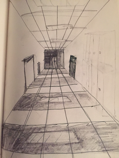
1. I used 1 point perspective.
2. I took this photo in my house of my dog looking at me laying his head on a table
3. I found using the black paint was very overwhelming and difficult. I was so afraid to mess up with it since it's hard to clean up black paint so it was a very stressful process.
4. The two warm ups I picked helped because the watercolor techniques taught me how to use the paint in different ways that I didn't know about before and the sunset perspective painting taught me to make the color lighter as it gets farther away and helped with making different shades of paint.
-Describe the artwork. List what you see. What images do you see? How would you describe it over the phone? Which art elements? Describe the color schemes.
-Analyze the artwork. List art elements and design principles. Color, value, line, shape/form, texture, space. Balance, emphasis, harmony, variety, movement/rhythm, proportion.
-Interpret the artwork. What is the mood? What feeling is communicated? What ideas are represented? What is the story being told.
-Judge the artwork. What do you think of the artwork? Is it successful? Why or why not? Support your opinions with evidence or criteria. (Art skills, meaning, creative, realistic)
It’s 1 point perspective. In my peace there is my dog cookie and him laying his head on my coffee which is a brown table looking straight at the camera. Around him is a Christmas tree to his right and directly behind him is a tv with a larger coffee table that’s black and a bookshelf with different colored books(green,red pink purple etc) all the colors of the color wheel. Lastly there’s a picture of a forest with the colors green.
There’s blue on the wall and dark purple on the tv with a almost dark black/blue square on the table which has rectangular shape on all 5 pieces . The bookshelf is a green with looks that have all the same colors as the color wheel and my dog is light brown with a little white hairs and black hair and his head is a circle with a with a sideways oval on the bottom with two circles as the ears and the table has laying on us brown and a rectangle shape. And it’s a equal image because it’s all going to the one point in the perspective.
The story is of my dog and how he loves me, you see the way he looked at me in the image. This idea represents animals being cared of and the love humans have for animals.
I feel like the artwork was very successful because the one point is of my dog and it looks clean and not sloppy at all. For example my dog had fine details on its body like his hairs and his eyes.so overall it was successful
16. Do over: If given the opportunity, which project would you do over? Describe why and how you would redo this project. Reasons might include choosing a different theme, using a different medium or creating a different idea completely. Include photo.
If I had the opportunity to do over any project I would pick the neoleum block because that was the first time I did it so it didn’t turn out that good and I would try to add more details, or pick a different color to use to print.
5. What is artistic style? the style of a particular artist or school or movement; "an imaginative orchestral idiom". Example FINE ART BY MOVEMENT.
Contemporary.
Pop Art.
Abstract Expressionism.
Cubism.
Art Deco.
Art Nouveau.
Post-Impressionism.
-Analyze the artwork. List art elements and design principles. Color, value, line, shape/form, texture, space. Balance, emphasis, harmony, variety, movement/rhythm, proportion.
-Interpret the artwork. What is the mood? What feeling is communicated? What ideas are represented? What is the story being told.
-Judge the artwork. What do you think of the artwork? Is it successful? Why or why not? Support your opinions with evidence or criteria. (Art skills, meaning, creative, realistic)
It’s 1 point perspective. In my peace there is my dog cookie and him laying his head on my coffee which is a brown table looking straight at the camera. Around him is a Christmas tree to his right and directly behind him is a tv with a larger coffee table that’s black and a bookshelf with different colored books(green,red pink purple etc) all the colors of the color wheel. Lastly there’s a picture of a forest with the colors green.
There’s blue on the wall and dark purple on the tv with a almost dark black/blue square on the table which has rectangular shape on all 5 pieces . The bookshelf is a green with looks that have all the same colors as the color wheel and my dog is light brown with a little white hairs and black hair and his head is a circle with a with a sideways oval on the bottom with two circles as the ears and the table has laying on us brown and a rectangle shape. And it’s a equal image because it’s all going to the one point in the perspective.
The story is of my dog and how he loves me, you see the way he looked at me in the image. This idea represents animals being cared of and the love humans have for animals.
I feel like the artwork was very successful because the one point is of my dog and it looks clean and not sloppy at all. For example my dog had fine details on its body like his hairs and his eyes.so overall it was successful
16. Do over: If given the opportunity, which project would you do over? Describe why and how you would redo this project. Reasons might include choosing a different theme, using a different medium or creating a different idea completely. Include photo.
If I had the opportunity to do over any project I would pick the neoleum block because that was the first time I did it so it didn’t turn out that good and I would try to add more details, or pick a different color to use to print.
- What is art?
5. What is artistic style? the style of a particular artist or school or movement; "an imaginative orchestral idiom". Example FINE ART BY MOVEMENT.
Contemporary.
Pop Art.
Abstract Expressionism.
Cubism.
Art Deco.
Art Nouveau.
Post-Impressionism.